Quick answer: choose the job of the wall before choosing a paint name. A light neutral can keep a small living room open, a single darker wall can anchor the sofa or fireplace, and a curved or two-tone shape can add character without covering every surface. Use the AI Room Paint Visualizer to compare a few directions on your own photo, then confirm the final color with physical samples in daylight and evening light.
Start With Light, Furniture, and the Real Room
Good wall painting designs for living room spaces are decisions about proportion as much as color. Before collecting screenshots, write down what the room must continue to do: welcome people, hold a television, frame a view, hide an awkward corner, or feel calm after dark.
- Map the daylight: note whether the room receives warm morning sun, cooler northern light, strong afternoon glare, or mostly lamps. The same beige, green, or blue can look completely different as the day changes.
- Choose the visual anchor: the sofa wall is common, but a fireplace, media wall, dining transition, or short wall beside a doorway may create a clearer focus. Do not automatically paint the largest wall.
- Keep fixed materials in view: flooring, wood tone, stone, trim, curtains, rugs, and large furniture affect whether a paint reads warm, cool, gray, yellow, or pink. Put samples beside these materials, not on an empty screen.
- Protect the movement path: a strong color can make a narrow passage feel tighter. Check door swings, walkways, radiator covers, shelving, and the sightline from the entry before committing to a full-height treatment.
- Decide how much contrast you can live with: a full accent wall is more permanent than an arch, a low color block, a painted niche, or a narrow band. The right level is the one you can still enjoy when the room is busy.
- Test the actual surface: a digital render can suggest direction, but a sample board reveals texture, sheen, shadows, patchiness, and how the color behaves beside the real sofa and floor.
12 Wall Painting Designs for Living Room Spaces
Treat these as twelve design directions rather than twelve rules. You can combine one shape with one restrained palette, but keep the number of competing decisions low. A living room usually feels more intentional when one wall has a clear job and the other surfaces give it room to breathe.
1. A calm full-height accent wall
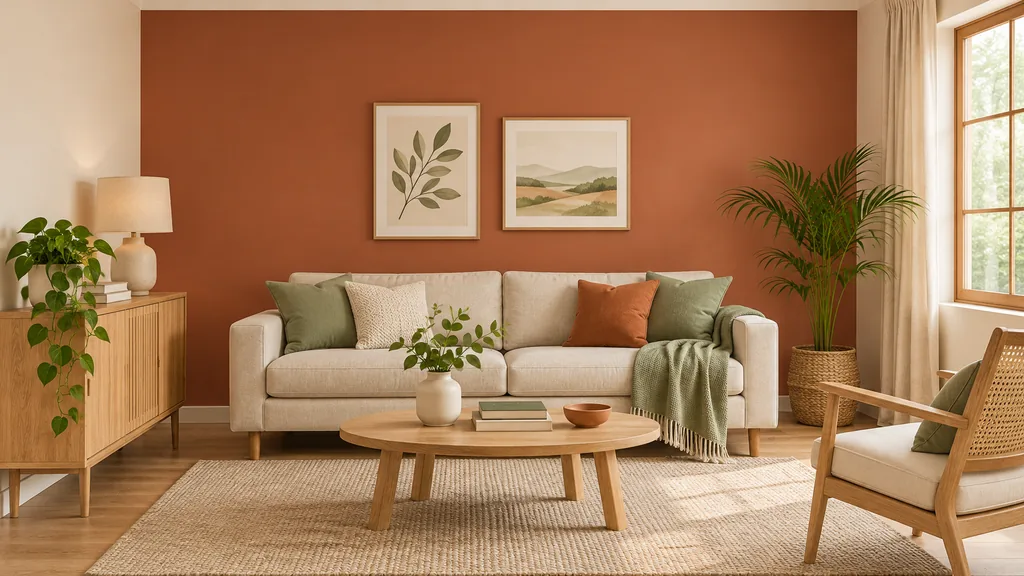
Paint the wall behind the sofa in muted olive, clay, blue-gray, or warm taupe while leaving the remaining walls lighter. This creates a visual home for the seating area without asking every object in the room to compete.
2. A warm neutral wrap
Use a connected family of cream, oatmeal, mushroom, or soft greige across the walls, then add depth through wood, linen, plants, and lighting. This works when you want the room to feel calm but not flat or stark.
3. A painted arch behind the sofa
A tall arch can act like a soft architectural frame without adding furniture. Center the curve on the sofa or artwork, keep switches and outlets clear, and let the surrounding wall stay quiet so the shape reads as intentional.
4. A two-tone horizontal wall
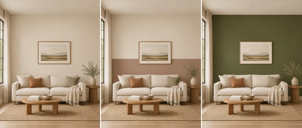
Split a wall into a lighter upper section and a deeper lower section, or reverse the balance for more drama. A horizontal line can visually ground a tall room, especially when it aligns with a console, picture rail, or sofa back.
5. A low color block for a console
A block behind a console, record cabinet, or reading chair gives a small function its own zone. It is easier to repaint than a full accent wall and can add color where furniture already provides a clear edge.
6. A deep media or fireplace wall
Charcoal, forest, navy, or a muted chocolate can reduce glare and give a television or fireplace a stable background. Keep the color controlled around shelves and cable openings so the wall looks considered rather than visually heavy.
7. A soft ceiling edge
Carry a gentle wall color a short distance onto the ceiling to make a large room feel more enveloping. This can soften an awkward ceiling line, but a very dark wrap may lower the perceived height in a compact room.
8. A vertical color panel
A narrow vertical panel can emphasize a tall window, a column, or the space between built-ins. It adds rhythm without making every wall a feature and can echo the proportions of a bookcase or tall plant.
9. A soft geometric pair
Two overlapping rectangles or a simple stepped shape can define a work corner or conversation zone. Choose neighboring colors rather than maximum contrast when the room has many furniture silhouettes.
10. A color that follows an architectural edge
Use a chimney breast, alcove, half wall, or stair return as the natural boundary. Painting an existing edge usually looks more deliberate than inventing a line across a blank wall, and it helps hide small changes in texture.
11. A light-on-light tonal wall
Pair a barely darker matte wall with a lighter trim or painted panel for depth without a dramatic accent. This is useful when you want the living room to stay bright but need a backdrop for art or a pale sofa.
12. A small painted niche or reading corner
A niche, bay, or reading seat can take a richer color without making the main room feel dark. Treat the color as a destination: add a lamp, small table, or artwork so the paint has a relationship with the way the space is used.
How to Test a Living Room Wall Idea Before You Paint
A photo preview is most useful when it answers one specific question: would the sofa wall feel better darker, does a warm neutral work with the floor, or is an arch too strong for the room? Use a repeatable comparison instead of choosing the most attractive single render.
- 1. Photograph from a normal standing height. Include the wall, windows, floor, sofa, doors, ceiling, and main light sources. Keep the phone level and avoid an extreme wide-angle view that changes the wall proportions.
- 2. Name one paint decision at a time. Ask for a muted accent wall, a soft neutral, a painted arch, or a two-tone treatment separately. Changing furniture, lighting, color, and shape together makes the result hard to learn from.
- 3. Compare three contrast levels. Try a close neutral, a medium accent, and a deeper shade. The set shows whether you want a barely visible shift, a clear focal wall, or a dramatic backdrop for art and media.
- 4. Check the fixed geometry in every result. Look for the real window, doors, outlets, sofa width, fireplace, shelving, and ceiling line. If a render moves or invents them, keep the image as mood inspiration rather than a construction plan.
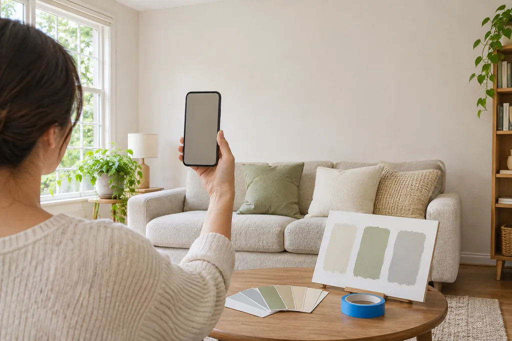
- 5. Validate with samples, tape, and evening light. Put sample boards beside the floor and sofa, mark an arch or color boundary with painter’s tape, and review it in morning, afternoon, and lamp light before buying the full amount.
Choose the Palette by the Effect You Need
Color names vary between brands and screens, so decide on the effect first. Take a few physical samples home and compare them beside the actual floor, sofa, rug, curtains, artwork, and lamps.
| Direction | What it can do | Watch for |
|---|---|---|
| Warm off-white or oatmeal | Keeps a smaller room light while adding softness beyond stark white | Some beige shades turn yellow beside warm bulbs or honey-toned wood |
| Muted sage or olive | Adds a quiet natural anchor and works with oak, linen, brass, and plants | Cool daylight can make gray-green paint appear flatter than expected |
| Dusty blue or blue-gray | Creates a cooler backdrop and can balance warm floors and tan upholstery | Strong blue can feel cold in a north-facing room or beside blue daylight |
| Clay, terracotta, or muted blush | Brings warmth and gives an arch or color block a clear purpose | Orange or pink undertones may fight red wood, bright art, or warm lamps |
| Charcoal, navy, or forest | Adds depth behind a media unit, fireplace, or pale sofa | Dark paint absorbs light; check glare, lamps, and the room’s evening mood |
| Near-color tonal pairing | Creates texture and a calm backdrop for art without a high-contrast feature wall | Different sheens can make two close colors look farther apart than planned |
Use AI to Preview Wall Colors, Not to Skip Real Checks
The AI Room Paint Visualizer can help compare broad paint moods on a real living room photo. It is useful for asking whether the sofa wall should be warm, cool, light, dark, plain, arched, or split into two tones before you spend time on sample pots and surface preparation.
For a wider change, the AI living room design tool can explore furniture, lighting, and decor around the wall direction. Keep the questions separate when possible: first settle the wall’s job, then check whether the rest of the room supports it. This keeps a pretty render from hiding a practical conflict.
A digital preview cannot promise the final paint color or the exact edge. Camera white balance, screen brightness, wall texture, sheen, reflections, and surrounding light all change what you see. Use the image to narrow the shortlist, then trust physical samples and real measurements.
What a Living Room Wall Preview Cannot Confirm
AI can smooth a wall, move a switch, simplify a door, change the window light, or extend color beyond the intended edge. These errors are easy to miss when the overall room looks attractive, especially in a dark or low-resolution photo.
A preview also cannot tell you whether the surface needs repair, primer, stain blocking, sanding, moisture treatment, or a specific paint sheen. It cannot replace manufacturer coverage guidance, a safe ladder setup, or a professional assessment of damaged plaster and persistent damp.
Use wall painting designs for living room images to compare direction, contrast, and mood. If a design includes a geometric line, measure the wall, mark it with tape, and inspect it from the entry and main seat. A useful visual idea becomes a good project only after the real room agrees.
FAQ About Wall Painting Designs for Living Room
What is the best wall painting design for living room spaces?
There is no single best design. A full-height accent wall is the easiest starting point, while an arch, low block, or tonal pairing adds character with less commitment. Choose from the room’s daylight, sofa position, fixed materials, circulation, and the amount of contrast you enjoy.
Which living room paint idea makes a small room feel larger?
A light, low-contrast palette usually keeps a small room feeling open. You can still add focus with a narrow vertical panel, a soft arch, or a low color block. Keep the ceiling and the main circulation path visually quiet so the feature has room to breathe.
Should the accent wall be behind the sofa or the television?
Use the wall that needs a visual anchor and can carry the color without creating glare. A dark television wall may reduce reflections, while a sofa wall may frame conversation and artwork. Check both viewpoints from the entry before deciding.
Are geometric living room wall designs difficult to paint?
They need more measuring than a straight accent wall, but a simple arch, panel, or two-tone line is manageable with a level, marked reference points, and painter’s tape. Test the proportions on paper and tape before opening the paint.
How do I choose a living room wall color with a wood floor?
Put samples directly beside the floor and compare their undertones. Warm wood often works with muted sage, clay, oatmeal, and softened blue, but the exact result depends on daylight, rugs, sofa fabric, and lamp color. Avoid choosing from a screen alone.
Can AI show how a wall color will look in my living room?
Yes. Upload a clear room photo to the AI Room Paint Visualizer and compare one wall decision at a time. Treat the result as a visual shortlist, then confirm color, surface, sheen, and measurements with real samples.
Should living room walls and the ceiling be the same color?
They can be when you want a wrapped, calm effect or need to soften an awkward ceiling edge. A lighter ceiling usually keeps a compact room brighter. Try a narrow sample first because warm lamps can make a ceiling wrap feel deeper at night.
Preview Living Room Wall Colors on Your Photo
Upload a real living room photo, compare wall directions, and use the shortlist to plan samples before you repaint.
Try the Room Paint Visualizer